
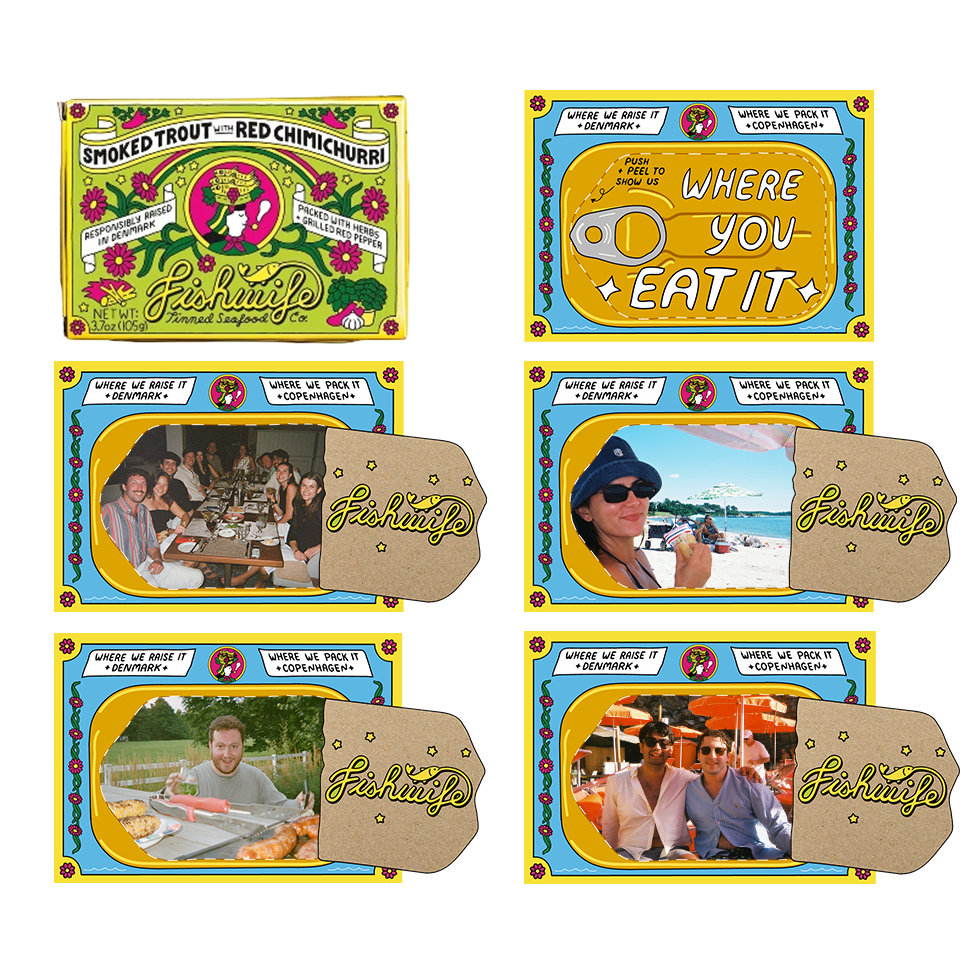
(Actual Fishwife box)
Push + Peel design proposal
FISHWIFE
Fishwife exercises an impressive amount of brand transparency through their products and branding, printing on every box where their fish was ethically raised and sustainably packaged. Sadly, they don’t receive the same transparency from their consumers. They tell us where it’s raised and where it’s packed; it’s time to show them where we eat it.
The concept is simple and fun: a perforated cardboard box, identical in dimension and material to those already being used by Fishwife distributors everywhere. The illustration on the back of the box is a brass-colored tin just like those that their product comes in. When you peel back the perforated section, you have a little tin-shaped frame to take photos through, then share where you’re enjoying their product, who you’re enjoying it with, or what tinned-fish inspired dish you’ve created.
For a brand that grew primarily on social media, this is a social-first effort to drive more attention to their product and create a pathway for their consumers to interact with a brand they love. The physical aspect of a make-shift picture frame offers a kitschy nostalgia that appeals to a Gen-X audience, and an old school aesthetic to the Gen-Z demographic.